{May 4, 2015}
Recently, the talented Stationer, Anika of Wedding Design by Anika launched an Etsy store so I met with her to discover more about her and the new collections.
Wedding Design by Anika said:
“I like it when people ask me what I do for a living. “I’m a Stationer”, I say,to which I usually receive some interesting expressions. Most tend to be on the confused side, so I follow up with “I’m a freelance Graphic Designer who specializes in wedding stationery.”
And I love doing it.
“What inspires you to make what you make?” is probably the second most asked question that I receive. To be totally honest, it can be anything. I can see a poster layout as I walk down the street that I would love to re-create in my own style, or a typeface that is just too beautiful not to experiment with. Many times, my clients bring in an object that inspires THEM, and their joy inspires ME to create something unique for them.
However, there are times when I just want to play with an idea, shape or colour, and a file is created waiting for the perfect moment to be used. So I decided to open up an Etsy store; to give these files new life as templates and to share them.
I’d like to introduce you to the 5 designs that I currently have in my store.
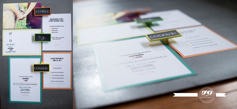 “Framed by Colour” was inspired by a stunning colour pallet that I had somehow acquired. I really wanted to highlight the use of colour, so there is a lot of white space to build that contrast.
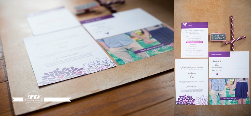 “Burst of purple” was the result of playing with a vector flower shape that I had purchased. Through that playing, I discovered that two of the petals combined became a heart. That heart then became the image that ties all the stationery items together.
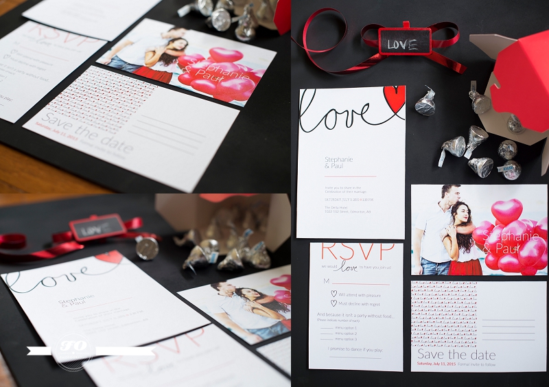 “Love” was also the result of seeing a vector seamless pattern that I fell in love with. The pattern of the heart being scripted into the text reminded me of the little cinnamon candy hearts that you can get around Valentine’s Day.
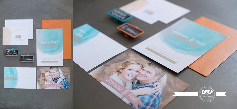 “Water colour and Ribbons” was created for a spring wedding inspiration shoot. I was provided with a colour swatch and decided to do two creations. One is light and fun, using the water colour delicately to make the colours pop (shown here). The other is more rustic looking, and gives the colours a deeper, richer feel.”
Thanks Anika for sharing these beautiful designs with us!


